UserControl - Custom Controls
In WPF a UserControl provides a way to encapsulate a design block with complete functionality. A user control allows you to extend an existing block like Border, Button, etc or to create a design and functionality from scratch.
Start by creating a new WPF project with C#. To add a new UserControl right click on the CustomCtrl folder and add new item, then choose the user control item. Save this item as CircleInfo.
In the CircleInfo.cs file (of the CircleInfo.xaml file) add 2 new DependencyProperties (make sure to set the data context in the constructor):
public partial class CircleInfo : UserControl
    {
        public static readonly DependencyProperty SizeProperty
            = DependencyProperty.Register("Size", typeof(double), typeof(CircleInfo));
        public static readonly DependencyProperty InfoProperty
            = DependencyProperty.Register("Info", typeof(string), typeof(CircleInfo));

        public double Size
        {
            get => (double)GetValue(SizeProperty);
            set => SetValue(SizeProperty, value);
        }
        public string Info
        {
            get => (string)GetValue(InfoProperty);
            set => SetValue(InfoProperty, value);
        }
        public CircleInfo()
        {
            InitializeComponent();
            this.DataContext = this;
        }
    }
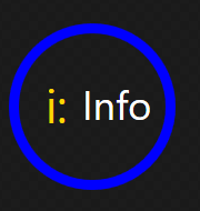
To create a circle with some text inside you can do that using an ellipse or even simpler (like CSS) provide a high corner radius value (more than 50% of the size). The code to make this is:
<UserControl x:Class="WpfApp1.CustomCtrl.CircleInfo"
             xmlns="http://schemas.microsoft.com/winfx/2006/xaml/presentation"
             xmlns:x="http://schemas.microsoft.com/winfx/2006/xaml"
             xmlns:mc="http://schemas.openxmlformats.org/markup-compatibility/2006"
             xmlns:d="http://schemas.microsoft.com/expression/blend/2008"
             xmlns:local="clr-namespace:WpfApp1.CustomCtrl"
             mc:Ignorable="d"
             d:DesignHeight="300" d:DesignWidth="300">
    <Grid>
        <Border Width="{Binding Size, FallbackValue=50}"
                Height="{Binding Size, FallbackValue=50}"
                CornerRadius="{Binding Size, FallbackValue=50}"
                BorderBrush="Blue"
                BorderThickness="3">
            <StackPanel Orientation="Horizontal"
                        HorizontalAlignment="Center"
                        VerticalAlignment="Center">
                <Label Content="i:" FontSize="14"
                       Foreground="Gold"
                       />
                <TextBlock
                    VerticalAlignment="Center"
                    Foreground="White"
                    Text="{Binding Info, FallbackValue=Info}"/>
            </StackPanel>
        </Border>
    </Grid>
</UserControl>
In MainWindow the implementation is straight forward. First step is to add a reference to the xaml namespace:
xmlns:comp="clr-namespace:WpfApp1.CustomCtrl"Then add the circle info configured as you want:
<Window x:Class="WpfApp1.MainWindow"
        xmlns="http://schemas.microsoft.com/winfx/2006/xaml/presentation"
        xmlns:x="http://schemas.microsoft.com/winfx/2006/xaml"
        xmlns:d="http://schemas.microsoft.com/expression/blend/2008"
        xmlns:mc="http://schemas.openxmlformats.org/markup-compatibility/2006"
        xmlns:local="clr-namespace:WpfApp1"
        xmlns:comp="clr-namespace:WpfApp1.CustomCtrl"
        mc:Ignorable="d"
        Title="MainWindow" Height="150" Width="150">
    <Grid Background="Black">
        <comp:CircleInfo
              Size="75  "
              Info="Hello"/>
    </Grid>
</Window>